

Custom Web Design Services for Modern Brands.
Great web design is not mere decoration—it is visual communication engineered to build trust and guide visitors toward meaningful actions. We craft custom digital interfaces that reflect your unique value proposition, avoid generic template cliches, and deliver a frictionless experience across smartphones, tablets, and wide desktop displays.
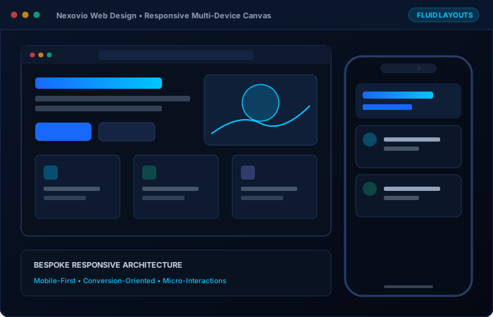
Visual Communication That Respects the User’s Intelligence
We reject off-the-shelf templates and generic visual themes. In a market flooded with identical SaaS layouts and boilerplate agency themes, a custom visual language communicates confidence, operational rigor, and premium value. Every screen we compose is tailored from scratch around your brand character, target audience, and commercial objectives.
Comprehensive Web Design Solutions
From initial low-fidelity wireframes to interactive Figma prototypes and production design systems, we craft cohesive digital interfaces.
Bespoke Visual Identity Integration
Translating your brand character into modern typography, bespoke color palettes, micro-interactions, and visual motifs.
Mobile-First Responsive Web Design
Intentional screen layouts engineered for every device breakpoint (320px to 4K) without clipped text or awkward viewport shifts.
Conversion-Centered Layout Architecture
Structuring content hierarchy, eye-tracking scan paths, trust signals, and prominent calls-to-action that systematically drive lead inquiries.
Interactive Prototypes & High-Fidelity Mockups
Interactive Figma prototypes providing a realistic preview of animations, page transitions, and component behavior before code execution.
Design System & Component Library Creation
Reusable design tokens, typography scales, button states, and card structures that ensure visual harmony across every inner page.
Website Redesign & Brand Repositioning
Revitalizing tired web interfaces to realign with elevated market positioning, modern customer expectations, and current web standards.
Engineered Mobile-First Across Every Breakpoint
More than 60% of modern web traffic originates on mobile devices. We do not merely shrink desktop designs—we design intentionally for touch targets (minimum 44x44px), legible mobile typography, collapsible navigation menus, and zero horizontal scrolling across 320px, 375px, 768px, 1024px, and ultra-wide displays.
- Zero layout shifts or truncated headlines
- WCAG 2.1 AA compliant color contrast standards
Deliverables You Receive
Web Design Frequently Asked Questions
Clear answers regarding our design process, feedback rounds, and responsive adaptations.
We reject off-the-shelf templates and generic themes. Every website we design is tailored from scratch around your brand identity, target demographic, and conversion goals, ensuring an authentic digital presence.
Yes. We design mobile-first with intentional adaptations for 320px, 375px, 768px, 1024px, and ultra-wide screens. Navigation, typography, and buttons are custom-tuned for touch interaction.
Absolutely. We provide interactive Figma prototypes and conduct iterative feedback cycles at wireframe and high-fidelity stages so you approve every detail before code is written.
Have a specific question not covered here?
Our engineering team reviews specifications and responds within 1 business day.